
We spend more time on our phones than ever before. According to a study conducted in February 2021, around 50% of users spend five to six hours on their phones. That is why it is crucial to target mobile app users with a stellar welcome page.
However, you cannot approach these app welcome screens like you approach website landing pages.
Mobile users are on the go. They multitask and already have other things in their minds, whether personal or business-related. Therefore, your welcome page should hit the users’ emotional triggers as quickly as possible to retain them longer.
In this article, you will find tips on how to create an app welcome page that converts. Without further ado, let’s dive in!
What is an app welcome page?
An app welcome page is what the user sees for the first time after landing on your product. It sparks the first interaction between the user and your product. A welcome page can appear as soon as they enter your app or start their free trial process.
A 2011 study by Gitte Lingaard, Gar Fernandes, Cathy Dudek and J. Brown revealed that we have only about 50 milliseconds to make a good first impression.
If you don’t get your welcome page right, you may not get a second chance to make up for it. A potential customer will look somewhere else.
An effective landing page design must consider the user’s needs. In other words, it should be relevant to them. Many businesses fail to understand this: Your welcome page is not about your product at all. With the help of an AI landing page generator, you can tailor your landing page copy to your brand and target audience.
It is about what your product will do to users and solve their problems.
That is why it is important to integrate a clean design. Place your calls to actions (CTAs) where the user can easily see and understand what the button will achieve. For mobile apps, this is even more important because mobile users think and act differently than desktop users.
Why does an app welcome page matter?
You know now that what stands between you and the user is 50 milliseconds. If they downloaded your app, then it’s great because you know the user is at least interested in your product.
How can you make them stay and explore more, though?
A great app welcome page helps you set the direction for a streamlined user journey. It will also boost your conversion rates because the user knows what value they will get and how to use it to improve their businesses or lives.
The right welcome page will activate users faster and make a smooth transition for onboarding with a walkthrough or product tour.
All in all, an app welcome page with a user-centric and clean design adds value to your customers and shows them that your app is the right choice for them.
5 Tips to Create an App Welcome Page that Converts
Now let’s look at the top five tips to create a stellar app welcome page that will convert users:
1- Leverage the Page to Segment Users
Relevant user experience is what makes your brand memorable and unique. If you can convey how this product will benefit them and why they should choose your brand over other competitors, then it will be easier to keep those users engaged.
You can also segment users into different categories to tailor your message. Remember that the value your customer is looking for will not be the same for everyone.
A business guru will probably look for deeper insights and advanced information whereas a beginner will prefer basic tips and “how-to” guides to establish a strong foundation.
Here’s how Notion segments users:
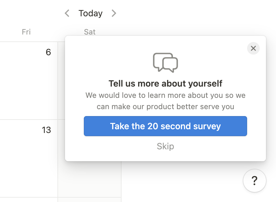
Notion’s 20-second survey is great for three reasons:
- It is short: The user knows the survey will not take much of their time. In other words, it is a small commitment that will eventually improve their experience, so they will be more inclined to complete it.
- You can skip it: No matter how short your survey is, giving the option to skip your survey will reinforce the idea that the user is in control.
If you do not give them this option, you are more likely to experience churn because who would not be frustrated after being forced into completing a survey they were not interested in? - Low-effort, high impact: If you ask the right questions with the right language, the rest is even easier. You will gather and analyze data based on your target personas and nudge users to continue with their user onboarding flows.
2- Gamification Makes It Easier
What is one thing that the users want?
Let me tell you: It is not an hour long video presentation about your app’s features and benefits.
What they want is to be understood and acknowledged as individuals. With unique problems and needs. You can go on and on about how your app is the best choice for them.
However, if they fail to see why your app is relevant to them, why it matters for their business, then you will have a hard time attracting new users and show them your app in action. They will leave.
This is where gamification comes in.
Gamification marketing is the process of applying interactive elements, storytelling, point scoring, or competing in your marketing efforts whether you are designing an app welcome screen or website walkthrough.
For mobile apps, it is a great way to show your app in action. It personalizes the customer journey by introducing multiple options and engages the user as they explore the app’s features.
You can integrate some of these elements in your app welcome screen with custom illustrations, CTA buttons and offer a personalized experience.
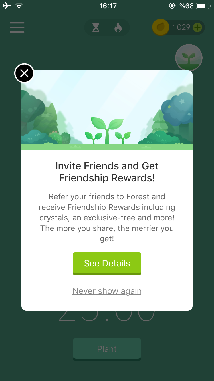
See how Forest nails gamification:
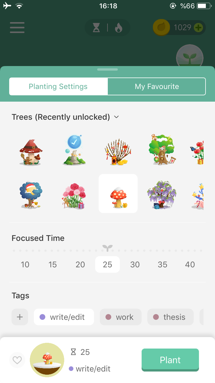
Forest is a productivity app that helps you stay focused and away from your phone so you don’t waste your time scrolling on social media and get your job done.
I have been using Forest for two or three years now. I wrote my senior dissertation and my assignments with it. I even used to read books without any distractions!
Do you know why I have been using this app for three years and not others? Gamification.
Forest is not your typical productivity app with task lists, deadlines, calendars. What do you do with it then?
You build a personal forest and win coins to buy different trees. You invite your friends and get rewards. You exit the app and kill your trees (and your productivity).
You get a personal forest, track the number of hours you stayed focused, and get the sense of achievement from earning coins and adding new trees to your inventory!
3- Prepare the User for Onboarding
The app welcome screen is not only the first step of the user journey. It also helps the user transition into the onboarding sequence once they are ready to discover what your app offers.
That is why it is important to prepare the user for onboarding on the app welcome screen. The next step should be clear in the user’s head, so they don’t have to search for what they need to do frantically.
The welcome page can make or break that connection. Therefore, it is not the best idea to introduce your app with an empty state.
Take a look at this example:
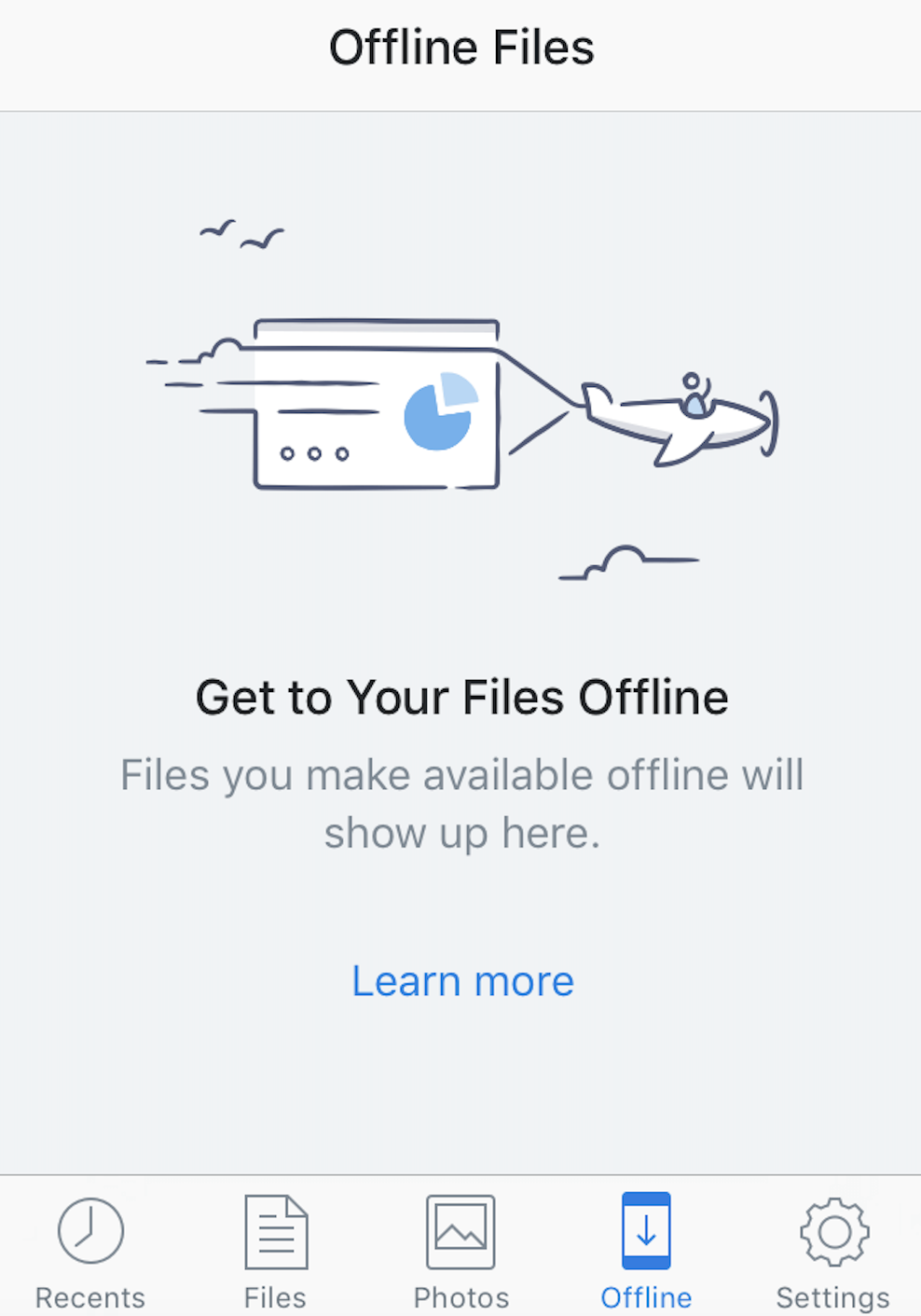
The user needs an additional step to learn about their offline documents. Every extra step you add to the welcome page is a possible friction, which in turn will make your user confused or angry.
Instead of directing your user to a web page to learn more about how to add their offline documents, adding clear calls to action buttons will make the process so much easier and reduce churn.
4- Offer a Taste of the App
App welcome screens are one of the best options to showcase what your product is capable of. After greeting the user with a personal welcome, you can nudge the user to complete key actions with a checklist.
You can also introduce benefits on the app welcome screen. See how Duolingo sets a great example:
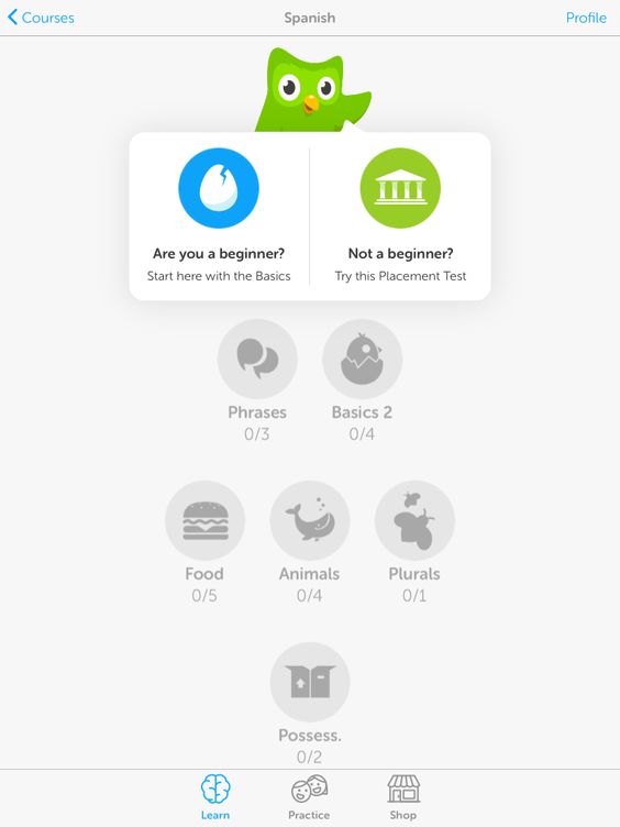
By offering a placement test, Duolingo not only segments its user but also shows them how the language learning in their app works. The first-hand experience shows how to complete a level, collect points, and compete with other users. This all happens on the app welcome screen!
Duolingo’s high-quality images, custom illustrations, and animations also form the perfect landing page for each customer segment.
5- Collect Feedback and Improve
Creating high-converting landing pages or welcome pages is no mystery if you pay attention to users’ behavioral patterns.
If you have questions, the answers are either buried in your data (which means you need to interpret them and run A/B tests) or in your users. Collect feedback as much as you can to increase user retention.
Poor user experiences usually result from believing you’re listening to the user while, in fact, you are not. Read customer reviews, note what they are commenting on. Those are the areas that you can improve. If the welcome page is too complicated, remove unnecessary design elements and test.
The more you listen and run tests, the higher your user retention will be.
Final Words
To rank higher in the organic search pages, you need an app welcome page that understands the user’s intentions. Try to capture your audience with a game-like approach, segment them into different groups, and make changes based on their feedback.
Tweak as you go. App welcome pages should be tailored for mobile users who are multitasking, on the go, and busy. Choosing a simplistic design that addresses the main pain points of users is always better than a fancy yet clustered page.

Author Bio: Aysenur is a Creative Content Writer at UserGuiding. She enjoys writing on SaaS, product, and growth for the UserGuiding Blog. Outside of work, you can find her reading a gothic novel or doing crossword puzzles in her room because words are everything to her.