
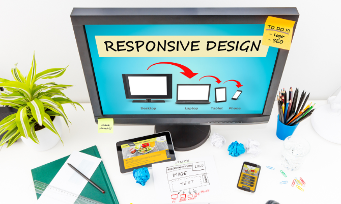
The majority of us are now aware that using a mobile device vs. a desktop computer to browse the web offers significantly different experiences. Mobile devices make up the majority of website visitors. Due to this, businesses are becoming more aware of the importance of having a mobile presence. The most commonly used method is responsive web design. The browser detects the user’s device and display size. This can help to serve the right version automatically.
It is the responsibility of website designers to provide desktop and mobile-compatible versions. The activities on your website must be planned so that they increase website traffic. In order to optimize your site, you will need the assistance of the best web design company. It is needed to increase the number of visitors.
Why Is It Crucial for Your Business to Hire the Best Web Design Company?
Everybody desires an attractive business website. But it’s also essential to build websites that concentrate on consumers’ needs rather than only developing a graphically appealing piece that fails to sell. The touch point for your brand is your company website. The conversion actually depends on it. You hardly have a few seconds to capture potential customers with an engaging and responsive website design. Some features of a good website design are:
- A good website design should be user-friendly, visually appealing and easy to navigate
- The design should be responsive so that it adapts to different devices and browsers
- It should have a well-optimized code that loads quickly
You cannot risk any kind of brand harm when operating a firm in a tough market like New York City. Professional websites can help your business gain more visibility. The selection of the best Web design company in NYC might make the difference between success and failure.
If you don’t have the top Website design company NYC working for you, it’s impossible to satisfy audience expectations. The best web design firms also work with internal stakeholders to develop a design approach that is unique to your company.
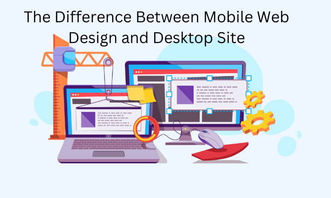
5 Differences Between Mobile Web Design and Desktop Site
Websites and mobile applications have proven to be crucial communication channels for brands. Yet, web and mobile have distinct characteristics. So, they need to be taken into account differently.
To create successful UI/UX experiences, it is essential to have complete knowledge of the platforms, functions, and usage behavior. After all, any migration will impact the look and feel of your UI/UX, whether you want to transfer your website with a WordPress migration or go from one device to another. Here are some main differences the best web design company keeps in mind while designing for each platform.
1. Arrangement of the Content
The way material should be structured is one of the trickiest aspects of designing for mobile. It’s possible that your mobile consumers’ needs are different from those of your pc ones. Furthermore, even if their needs are the same, the type of device people use will affect how they browse.
The arrangement of website content to satisfy mobile users should be the top focus when developing for mobile. For mobile devices’ small screen sizes, content should be placed vertically. Desktop devices are designed to be in portrait mode.
Portrait mode allows content to fill the entire screen and frequently allows numerous messages or images. The most common mode for using mobile devices is portrait. This indicates that horizontal space is restricted even in landscape mode.
2. Display Size
There are more opportunities to add content on the desktop version of the website. Navigation, in particular, is affected by screen size in every element of design.
Fixed navigation bars are compatible with desktop websites. Pull-out menus are typically the only option for mobile devices. This is quite useful for crawling and indexing. Since users may discover new sections that they were actually unaware of.
Mobile apps must save screen space whenever possible. This is why a website design company must be mindful of which features are significant enough to display. It’s important to give preference to the features and content that consumers are most likely to need. This is important when accessing a site via a mobile device.
3. Menus
Menu formatting is obviously a key area where desktop and mobile differ from one another. Mega-menus with a large number of categories and subcategories are typical on desktops. This kind of design works well for desktop users who have big screens. This makes them easily see the content in such menus and quickly click on text links.
On mobile, things are a little different. This is due to the size difference between thumbs and screens. Best Web design companies must consider these factors while creating mobile menus. It also means menus with many options should be vertically positioned. Moreover, they should have single-level menus with large text or buttons.
Menus on mobile devices drop as a user focuses on a category before opening again. Always be mindful of the needs and information-gathering methods of your mobile users while developing new content.
4. Situation-Based Design
The versatility of mobile devices is yet another significant difference from desktop browsers. A website design company didn’t have to worry much about where or how users were engaging with a website when everyone was using a desktop. However, the situations in which consumers find themselves when using their phones are now limitless. Mobile devices are small, accessible, and almost always interconnected.
Therefore, it is crucial to consider scenarios when developing for mobile. Internet connectivity changes, users’ locations change, and their attentiveness keeps changing as well. On mobile, users demand quick, simple interactions. It is not to imply that they won’t engage in long, detailed interactions. However, such interactions will be few.
5. Pictures and Text
The usage of graphics on websites can serve a variety of functions. It includes navigating, marketing, and promotion. In contrast, mobile site designs frequently lack advertising or marketing graphics. For navigational purposes, the firm logo is still present. The home page can be accessed by tapping it.
Some mobile devices are not compatible with the software that is typically used for designing desktop Web sites. Other factors include the limited screen space available for content presentation and the slow mobile device internet speeds.
However, When it comes to web design, it’s important to pay attention to both the mobile and desktop versions of your website. That’s because different devices have different display sizes, which can affect how well your website looks and works.
For mobile web design, the ideal image size is generally 479px wide by 253px tall. For desktop web design, the ideal image size is usually 1900 px wide by 1005 px tall. It will also make sure that your website looks good on a computer screen as well as a smartphone or tablet.
In Summary
Mobile and the web each have distinct uses. It’s important to understand users. Know what your users anticipate from each platform in order to deliver a flawless UI/UX experience. Consider the fact that people would prefer to have access to the same data and content on both the web and mobile.
To ensure user satisfaction, each platform’s content organization should be unique. Essentially, interface design might be the primary focus of mobile features, whereas information architecture can be the primary focus of web features.
Using your website to reach your audience is the best option for spreading your messages. You might seek the help of the best web design agency with expertise in creating websites that follow the most recent strategies.