
A wallpaper app needs more than a folder of attractive pictures. People open it expecting images that suit their screens, match their tastes, and remain easy to browse. Yet a collection assembled from unrelated AI prompts can feel inconsistent: one landscape is overly detailed, another has distorted objects, and a third loses its focal point behind the phone’s clock. These problems become more obvious when dozens of images appear together.
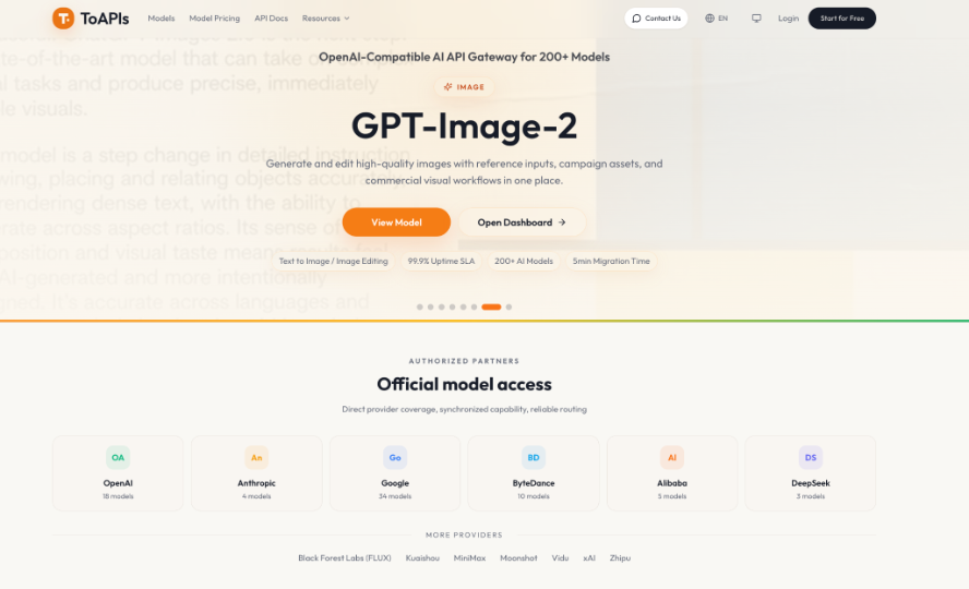
The solution begins before generating anything. Define a recognizable theme, set technical requirements, and evaluate every image in the context where people will use it. If you plan to produce many variations or maintain several themed collections, an API gateway such as ToAPIs offers a way to access image models through a shared integration. The following workflow covers creation, screening, organization, and preparation for an Android wallpaper app.
Start With a Collection People Can Recognize
Choose a narrow visual promise instead of combining every style you enjoy. A collection called “Quiet Night Gardens,” for example, could feature moonlit plants, muted blues, and gentle pools of light. Write down three fixed attributes, such as palette, atmosphere, and illustration style, plus two details that may change, such as plant species and camera angle.
Next, decide who will use the images and how. A minimalist collection should leave open space behind app icons, while richly detailed fantasy artwork may appeal to people who prefer dramatic lock screens. Sketch twelve concepts, grouped into three categories of four. If two descriptions would produce nearly the same wallpaper, replace one with a different composition.
Build a Repeatable Image Generation Workflow
Write Prompts Around the Phone Screen
Start each prompt with the subject and visual style, then specify composition and the intended display. For the garden concept, a useful direction might be: “Moonlit fern garden, soft indigo and sage palette, delicate illustrated textures, central path low in the frame, uncluttered upper third, vertical phone wallpaper, no lettering.” The open upper area leaves room for system information, although final clock and icon positions vary by device.
Keep a prompt sheet with one row per image: collection name, subject, palette, composition, prompt version, and review status. When an image looks muddy, try simplifying the background or adjusting the lighting description before replacing the entire prompt. This record helps you identify which instructions consistently produce usable results rather than relying on memory.
Generate and Track Candidate Images
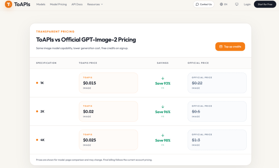
For a scripted production workflow, GPT Image 2 API can handle the image-generation step. Its documented POST /v1/images/generations endpoint accepts a prompt, the model identifier gpt-image-2, and portrait ratios including 9:16. Requests create asynchronous tasks, so your process must store the task ID, check its status, and collect the image only after completion. Reference-guided variations can use publicly accessible image URLs in reference_images; upload local references first instead of sending raw base64 data.
Generate a small pilot batch before attempting the whole set. Compare three or four candidates against the same design brief, then record whether the subject, negative space, and colors hold together. If you are using a manual image tool instead, follow the same prompt and review process. An API is useful for repeated production, but it is not a requirement for building a wallpaper collection.
Separate Selection From Final Editing
Select candidates at thumbnail size first. Users often browse a grid, so an image with excellent detail but a weak silhouette may be difficult to recognize. Then open the strongest files at full size and inspect fine edges, repeated shapes, accidental text, and distorted objects. Reject images with obvious errors rather than assuming cropping will hide them.
Test Wallpapers on Real Phone Screens
A portrait ratio is a useful starting point, not a guarantee that an image will fit every Android device. Preview each candidate on two screen shapes. Look at the top area for clock readability, the center for subject visibility, and the bottom for navigation or dock elements. Keep important details away from edges.
Test both lock-screen and home-screen use where possible. A bright, high-contrast background can look striking alone but make white icons or notifications harder to read. Adjust brightness, crop, or contrast in an editor and check again. If a wallpaper depends on perfectly positioned text or a tiny object, it is probably too fragile for a general-purpose collection.
Organize Files Before Building the App
Export approved images in a common format your app workflow accepts, and keep a consistent naming system such as night-garden-01 rather than vague names like final-new-2. Record the source prompt, select crop, dimensions, category, and any editing steps. Prepare smaller preview images separately when your chosen builder supports them; Users should not need to download a full-resolution file just to inspect a grid thumbnail.
Arrange the first screen around useful choices, not simply upload order. Categories such as “Moonlit Paths,” “Botanical Close-Ups,” and “Misty Landscapes” communicate visual differences immediately. Before publishing, confirm the builder’s actual requirements for file import, image display, downloads, and wallpaper-setting behavior. Those features depend on the selected template or implementation, not on the image-generation service.
Test and Maintain the Collection After Launch
Run through the app as a new user would. Can someone understand the categories without instructions? Do previews match the files they open? Are images sharp enough on a normal phone, and do they remain usable after cropping? If an image looks good in the gallery but fails once applied as a background, replace its crop or remove it from the release.
Keep a short review log for future updates. Record which images need improved contrast, which categories feel repetitive, and which source files require permission checks. Add new artwork in small, themed batches rather than flooding the app with near-duplicates. If you include recognizable people, branded characters, or third-party photographs, verify that you have the necessary rights before distributing modified or generated versions.
Make the First Collection Worth Keeping
A coherent wallpaper app can begin with a dozen carefully reviewed images. Define a theme, generate controlled variations, test them behind real phone interfaces, and organize the approved files into categories people understand. Treat rejected outputs as useful feedback about the prompts and compositions that need improvement.
The next improvement should come from observed usability, not simply a larger image count. If the collection is easy to browse and each wallpaper remains attractive when cropped, you have a solid foundation for adding new themes over time. Quality control gives the artwork a consistent identity and makes the app more pleasant to return to.